5 reasons your website NEEDS to work on mobile

This is something that you’ve heard before. And then again. And Again. And Again.
Why do you keep hearing it?
Because internet use on the mobile is at a whopping 67% on a global scale. This is up from 56% in only a few years and will only continue to grow as users get more comfortable on mobile devices.
Here are 5 reasons that you need a website that works well on mobile devices.
1. Everyone is on Mobile Devices
Smartphones are no longer the exception for internet users, they’re the norm. A study by We Are Social and Hootsuite showed that 19.16 million people from Australia access the internet through their phone. With a national population around the 24.61 million mark that is 77% of Australians with internet access on their mobile device and these numbers are only growing.
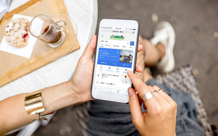
2. Available for Any User at Any Time
Think about how often you’re on your phone. And what do you do when you think of something you want to know more about? We’re guessing that you pull your phone out and search google for what you want to know. That’s exactly what your customers are doing. They don’t always have access to a desktop or laptop computer but it’s a near certainty they have near constant connection with their phone.
3. The User Experience (UX) is Improved
Do you remember the time before mobile websites when you had to zoom in to be able to read the text? If you had an experience like that now you would probably decide the website isn’t worth the hassle, no matter how good the content was, and go somewhere else. Users want the information that they’re looking for to be at their fingertips when they want it and they’re not going to stick around if you make it difficult to find. In the process of designing a mobile friendly website you want to consider what information your mobile visitors are trying to find and make the navigation to that information easy. If you get the UX design wrong your visitors will get frustrated but if you get it right your visitors won’t even notice that it’s there.
4. Mobile Users Buy More
If you have an online store then this is a point that you’re sure to be happy about. A 2017 study found that 45% of all Australian online purchases were completed on a mobile device with purchase spends increasing by 43% from last year. This isn’t even taking into account cross-platform purchases where shoppers do research on one device (such as a smartphone) and ultimately purchase on the desktop site or even in-store. Shoppers are even accessing your online shop whilst in your brick-and-mortar store as they research items they see for additional information and reviews. If your shoppers have a negative experience at any point in this sales journey they’re likely to abandon the purchase or go to a competitor.
If you have an online shop we recommend checking how easy the shopping and research processes are on mobile and tablet devices to make the most of this rise in online shopping on the go.
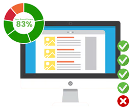
5. Good Mobile Experience Helps Search Engine Optimisation (SEO)
In recent times Google has been putting more focus on the user experience of its users. With the rise of searches on mobile this has lead to mobile first indexing and rewarding sites with good mobile experiences for its users. As long as you follow best practices for your mobile design and your rankings will improve.
All of our websites developed since 2016 are mobile responsive and work well across all screen sizes. If your website is older than this or you’re looking to improve your website for mobile contact us now to discuss how we can help make your website stand out on mobile.
Related News & Information

The ABCs of Mobile First Indexing
For the past year Google has been testing and experimenting “mobile first” indexing of websites and the rollout of this indexing method began earlier this year. But what is mobile first indexing and why is Google making this change?
Local Area Marketing: What is it?
When you’re searching for a service in Google how often do you add “near me” or “Your Suburb” on the end? If you do this you’re not alone. Since 2016 this is an ever increasing addition to searches as geolocation technology gets better. Google even likes to go one step further and prioritises showing you results that are located near you, wherever possible. Your business can use this to your advantage with Local Area Marketing (LAM).