
Mastering Layout for Print vs. Web
One of the most intriguing design challenges is mastering the art of layout for different mediums. While print and web design share foundational principles, the execution varies significantly. Understanding these differences is crucial for any designer aiming to create compelling and effective visuals in both realms.
The Fixed Nature of Print
Print design, a long-standing discipline, is inherently fixed. Once a piece is printed, its layout cannot be altered. This permanence demands meticulous planning and precision. Here are some key considerations for print layout:
1. Dimensions and Resolution
Print materials have specific dimensions and high-resolution requirements. Designers work with set sizes such as A4, A5, or custom measurements, and resolution is typically set at 300 DPI (dots per inch) to ensure clarity and detail.
2. Typography
Typography in print must be legible and aesthetically pleasing. The choice of fonts, sizes, and spacing is crucial. Print design often uses a mix of serif and sans-serif fonts, with a focus on readability and hierarchy.
3. Colour Management
Colour accuracy is vital in print. Designers use CMYK (cyan, magenta, yellow, black) colour model, and they must consider how colours will appear once printed. Colour profiles and proofing are essential steps to ensure the final product matches the design.
4. Static Elements
Everything in a print layout is static. Designers use grids and guides to create balanced and structured layouts. Elements are positioned with precision, knowing they will not change once printed.
5. User Experience
Print design considers the reader's journey through the material. Whether it’s a book, magazine, or brochure, the layout guides the reader’s eye from one element to the next, creating a seamless experience.
The Fluid Nature of Web
Web design, on the other hand, is fluid and dynamic. It must adapt to various screen sizes, resolutions, and devices. Here are the main aspects to consider:
1. Responsive Design
Web design must be responsive. This means layouts should adapt to different screen sizes, from large desktop monitors to small mobile screens. Fluid grids, flexible images, and media queries in CSS are essential tools for creating responsive designs.
2. Typography
Web typography is more flexible but also more challenging due to varying screen sizes and resolutions. Designers often use web-safe fonts or embed fonts through services like Google Fonts. Font size, line height, and spacing need to be adjustable to ensure readability across devices. Adding breaking spaces in the text to make it work better at one size can mess it up at another size.
3. Colour Management
Web designers use the RGB (red, green, blue) colour model. They must consider factors like contrast and accessibility. Colours can look different on various screens, so testing and adjustments are necessary to ensure consistency.
4. Interactive Elements
Web layouts include interactive elements like buttons, links, and animations. Designers must consider user interactions and how these elements enhance the user experience. Consistent navigation, clear calls to action, and intuitive interfaces are key components.
5. User Experience
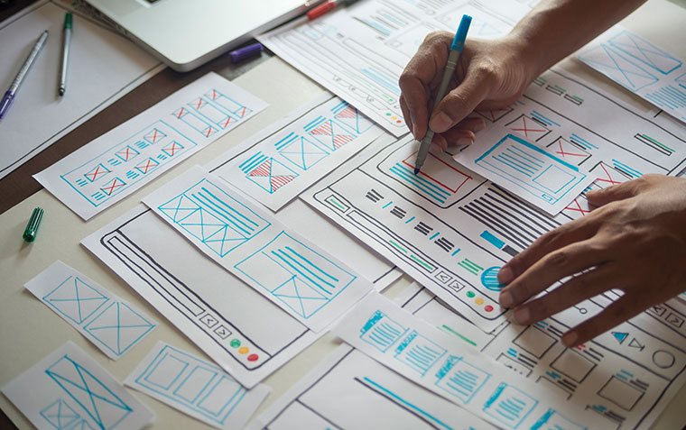
Web design focuses heavily on user experience (UX). This involves ensuring fast load times, intuitive navigation, and accessibility for users with disabilities. Designers use tools like wireframes and prototypes to plan and test layouts before implementation.
Bridging the Gap
While print and web design have distinct requirements, mastering both involves understanding their unique characteristics and how to leverage them effectively. Here are some tips for transitioning between print and web layouts:
1. Embrace Flexibility
When moving from print to web, embrace the fluidity of the medium. Allow for flexible layouts that adapt to different devices and screen sizes. Accept that you can’t control the device a user will access the website on and this can have a large variance in sizes, colour profiles, and resolutions.
2. Prioritise Content
In both mediums, content is king. Ensure that your design enhances the content and does not overshadow it. Good hierarchy and clear typography are crucial in both print and web.
3. Test Thoroughly
Testing is more extensive in web design due to the variety of devices and browsers. Ensure your design looks good and functions well across all platforms.
4. Keep Learning
Design trends and technologies are always evolving. Stay updated with the latest tools, techniques, and best practices in both print and web design.
5. Collaborate
Working with other designers and developers can provide new insights and solutions. Collaboration is especially important in web design, where technical and creative aspects must work together seamlessly.
***
Mastering layout for print and web involves understanding their fundamental differences and leveraging the strengths of each medium. By embracing the fixed nature of print and the fluidity of web, designers can create compelling and effective designs that captivate and engage their audiences. Whether you’re designing a striking magazine spread or an interactive website, the principles of good design remain constant—clarity, balance, and user-centricity.
Related News & Information
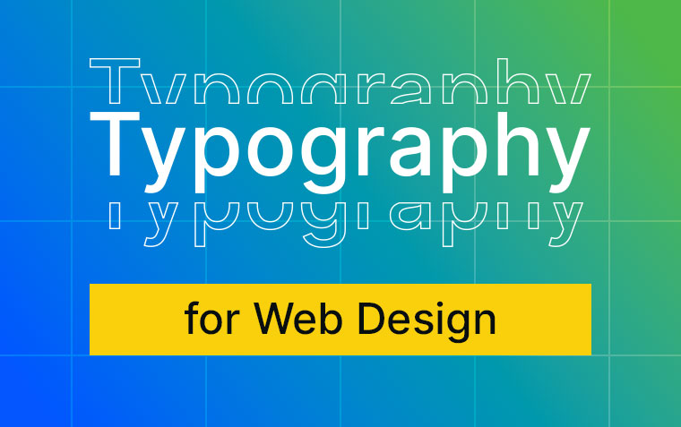
The Role of Typography in Web Design: Best Practices and Tips
Explore the role of typography in web design as well as read about best practices and tips to help you.
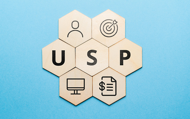
The Power of a Strong USP: Crafting the Perfect Landing Page
Discover the importance of a Unique Selling Proposition (USP) on your landing pages. Learn how to craft a compelling USP that captures attention, builds trust, and drives conversions.