The ABCs of Mobile First Indexing

For the past few years Google has been using “mobile first” indexing of websites. But what is mobile first indexing and why is Google making this change?
A. What is it?
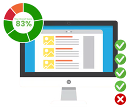
Google’s index is created by “crawler” bots that collect data from your website and this provides the basis for your rankings. With mobile first indexing these bots are primarily crawling and indexing the mobile version of your website. If these bots determine that your site is mobile friendly your rankings for both versions get a boost. If you don’t have a mobile friendly version these bots will just crawl your desktop site but this will hurt your rankings overall.
What this means is that Google is considering your mobile website the primary website with your desktop being secondary.
B. Why is Google adopting it?
As of 2015 searches made on Google have been predominantly on mobile devices instead of desktops. With this shift Google has been putting a focus on the user experience for those on mobile to ensure they’re providing the best user experience possible. Google’s desktop first indexing system had the potential to hurt their mobile users’ experiences if the mobile version provided different information to the indexed desktop version so they began planning for this change in indexing methods.
C. What changes can you expect?
If you’ve got a responsive site with us you don’t have to worry about any changes to your rankings as this follows Google’s Best Practices. This is because your site will load to fit whatever device it’s being searched on and the content remains the same across all platforms.
What you can expect is for Google to begin prioritising your mobile website, and for loading speeds to have more impact on your rankings.
D. How do you make the most of the change?
This is an opportunity to look at how your site is working on mobile and how quickly the pages load. We recommend checking your mobile site yourself as well as getting a friend or someone who hasn’t seen it before test it out and see what they think. If you’re unhappy with how your site works on mobile, or you don’t have a responsive website yet, contact us today to discuss how best to optimise your mobile site for a great user experience.


