
Responsive Web Design
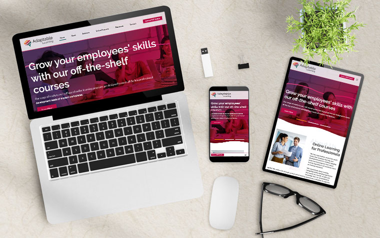
Looking for a responsive web design that adapts to any screen size? Look no further! A responsive website is a mobile-friendly site that displays and navigates seamlessly on various screen sizes, including desktops, tablets, and smartphones. Our responsive web design approach ensures that your website looks great and is easy to navigate, regardless of the device your visitors use.
With the growing number of mobile users each year, having a mobile-friendly website is crucial to providing a positive user experience. A responsive website allows your visitors to navigate your site with ease, resulting in longer site visits and increased conversions.
Not only is a responsive website essential for user experience, but it is also crucial for search engine optimization. Google prioritizes mobile-friendly websites in their search results, which means that having a responsive website can significantly impact your online visibility and ranking.
At Web Ideas, we understand the importance of responsive web design, which is why all of our new website builds are mobile-responsive. With 96% smartphone saturation in Australia, it's no longer a choice - your website must be mobile-friendly. Don't fall behind the competition, contact us today to ensure your website is responsive and ready to impress.
Examples of industry use cases for Responsive Web Design
-
Ecommerce Websites: With the increasing number of online shoppers using their mobile devices to make purchases, ecommerce website designs must provide a seamless mobile experience for their customers. A responsive design allows the website to adapt to different screen sizes, making it easy for customers to browse products, add items to their cart, and complete their purchase.
-
Business Websites: A responsive website is essential for businesses of all sizes. Whether you run a small local business or a large corporation, a mobile-friendly website is critical to engaging with customers and driving sales. With a responsive design, businesses can provide their customers with an optimal browsing experience on any device.
-
News and Magazine Websites: News and magazine websites receive a significant portion of their traffic from mobile devices. By adopting a responsive web design, these websites can provide an excellent user experience for their readers, regardless of the device they use to access the site.
-
Travel and Hospitality Websites: The travel and hospitality industry relies heavily on mobile devices for booking and reservations. With a responsive design, these websites can provide a seamless experience for their customers, allowing them to browse travel options, book reservations, and access travel information on the go.
-
Educational Websites: Educational institutions, such as universities and schools, require a responsive website to provide an optimal experience for students, faculty, and staff. With a responsive design, educational websites can provide access to important information, course materials, and resources, regardless of the device their users use to access the site.
-
Information websites play a vital role in delivering timely and accurate information to their users. Whether it's a news website, a government portal, or a business site, it's essential that these websites have a responsive design that allows users to access the information they need from any device. With a well-designed information website, users can easily search for and access the latest news, resources, and data they need, helping them stay informed and make informed decisions. Whether it's a mobile device or a desktop computer, a responsive information website ensures that users can access information quickly and easily.
These are just a few examples of how responsive web design can benefit different types of websites. Ultimately, a responsive website is critical for providing a positive user experience and ensuring your website is accessible to as many users as possible, regardless of the device they use to access it.
Related News & Information

Top 10 Problems Solved by Using Membership Management Software
Membership management software is an essential tool for any organisation, club, or association that needs to manage memberships. It streamlines many of the processes involved in managing memberships, making it easier for organisations to focus on other aspects of their operations. In this article, we will explore the top 10 problems solved by using membership management software

Information Websites
By putting relevant information online, you help your customers answer their own questions, so they ring you with a more specific request. This is an information website - it helps your customers relate to you more closely.
Create an Effective Design
To create an effective Web Design, there are a number of steps. We look at the total online picture for your business and develop a website and online solution with you

Keep it All Running Smoothly
Our business relies on our hosting and website integrity. The internet is an ever-changing environment with many risk factors, from technological advances through to hackers wishing to do harm.

How to write great content for your website
Writing content for your website can be a daunting task when you don’t know where to start. Here are some guidelines for you to help with the content creation of your website.

SEO and WebGUI - How they work together
Search Engine Optimisation (SEO) is critical in today’s digital landscape. With an estimated 95% of web traffic going to results on the first page of a search it’s important to be up there. Read about WEB IDEAS' inbuilt SEO features you can use to improve your ranking.

A Guide to Using Stripe as Your Website Payment Gateway
If you're looking for a reliable payment gateway to seamlessly process payments on your website, Stripe is an excellent choice.